Global Clean Water Initiative Flyer
Applying Target Audience Research to Effective Design
Applying Target Audience Research to Effective Design
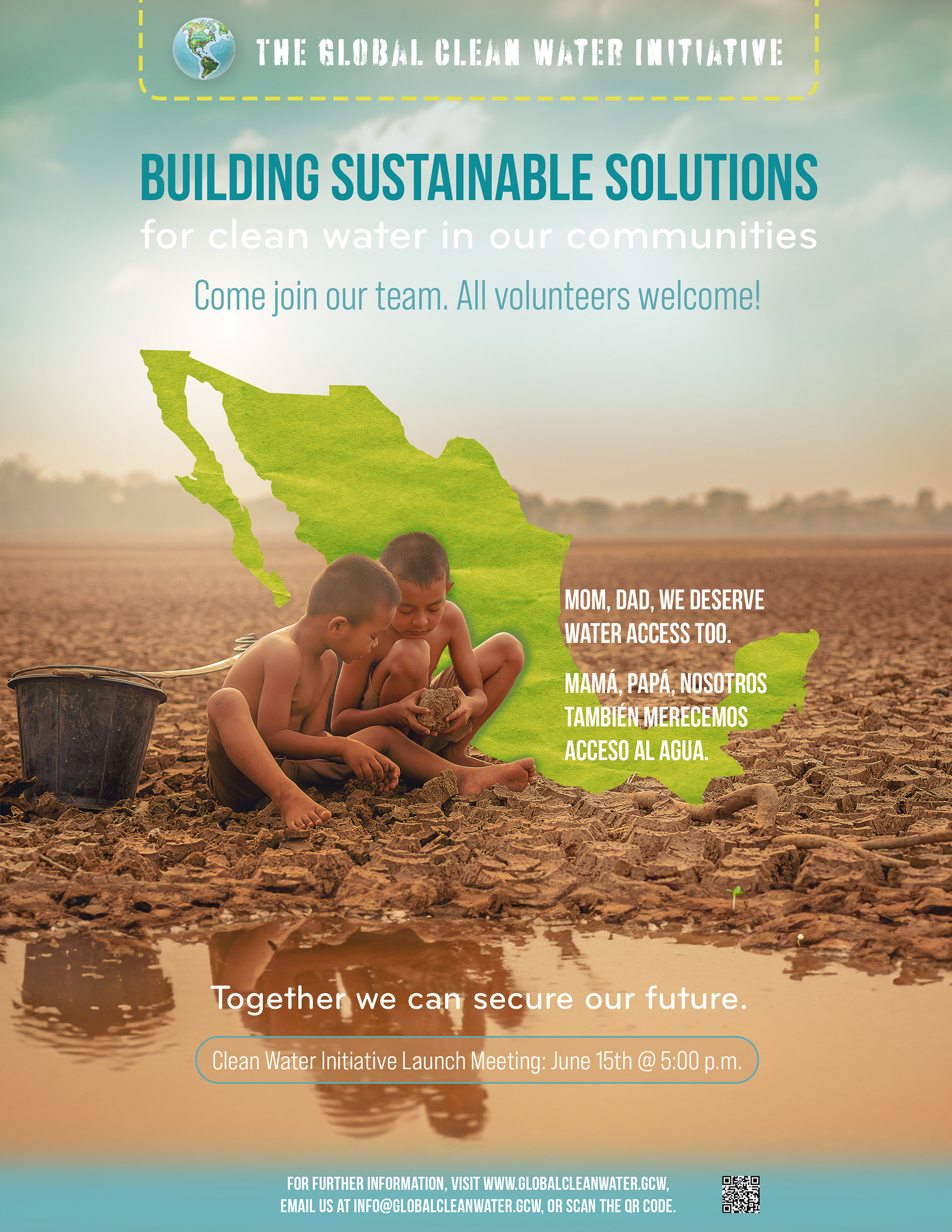
This flyer was designed for the Global Clean Water Initiative to raise awareness and encourage community engagement in addressing water scarcity in Mexico. Every design decision—from color choices to typography and layout—was strategically informed by comprehensive target audience research, ensuring both cultural relevance and visual impact.
Strategic Use of Color:
The palette of turquoise and green was chosen based on cultural insights. Turquoise evokes warmth and optimism, while green, used in the country outline and logo border, reinforces the initiative’s environmental mission and connects with the audience’s values.
The palette of turquoise and green was chosen based on cultural insights. Turquoise evokes warmth and optimism, while green, used in the country outline and logo border, reinforces the initiative’s environmental mission and connects with the audience’s values.
Emotionally Engaging Imagery:
A carefully selected photograph of two young boys in a dry, desolate landscape highlights the harsh reality of water scarcity. The addition of a small green sprout amid the mud serves as a hopeful visual cue, encouraging action while maintaining an empathetic tone.
A carefully selected photograph of two young boys in a dry, desolate landscape highlights the harsh reality of water scarcity. The addition of a small green sprout amid the mud serves as a hopeful visual cue, encouraging action while maintaining an empathetic tone.
Typography for Clarity & Impact:
The combination of Bebas Neue and Bicyclette creates a strong visual hierarchy. Bebas Neue’s bold, turquoise text commands attention, while Bicyclette adds contrast and cultural relevance. The bilingual message in English and Spanish enhances accessibility and strengthens the audience’s connection to the cause.
The combination of Bebas Neue and Bicyclette creates a strong visual hierarchy. Bebas Neue’s bold, turquoise text commands attention, while Bicyclette adds contrast and cultural relevance. The bilingual message in English and Spanish enhances accessibility and strengthens the audience’s connection to the cause.
Intentional Layout & Design:
The flyer’s structure was designed for both aesthetic appeal and functionality. A map of Mexico subtly reinforces the geographical context, while child-like elements in the logo and globe align with the audience’s family-centric values. Meeting details are prominently placed to guide potential volunteers with ease.
The flyer’s structure was designed for both aesthetic appeal and functionality. A map of Mexico subtly reinforces the geographical context, while child-like elements in the logo and globe align with the audience’s family-centric values. Meeting details are prominently placed to guide potential volunteers with ease.
By leveraging research-driven design strategies, this flyer effectively communicates its message while resonating with its intended audience. This project exemplifies my ability to blend research, design principles, and cultural awareness to create compelling, purpose-driven visual solutions.